Monday, July 28, 2014

Thanks So Much! MIM and MORE!


I am playing along with this week's PTI Make It Monday Challenge.  This week we are to create a diamond wallpaper pattern.   I am also playing along with this week's Just Us Girls Inspiration Photo Challenge.


For my card I chose to use PTI Lovely Layers set to create my background image. I was playing off the many colors I see in the inspiration picture.  I thought this image looked like the different colored pinwheels.   For the centers,  I stamped the solid small floral image from Basic Backgrounds: Venice.  


Love the banner triangle flag idea we can, have a little table where people can write on them and then hang them up as you walk around you can look at what everyone wrote:))  kind ckassic american bbq decor right?I added the sentiment to the hello sunshine die cut from kraft card stock.  I stamped with true black ink the sentiment from  Mini Blooms stamp set.  I added some stitching.  I just had to add the larger of the new scribble dies cut from vellum.  I just love these dies to create a whimsical detail  element.  I finished with some homemade enamel dots.

I mounted my card to a kraft background to resemble the beige background wall in the photo.  I think my camera is on its last leg.  Boo Hoo!  It is not working right.   I will try to take a better photo in the morning and see if that will help.  


As always thanks so much for stopping by!

Betty

Saturday, July 26, 2014

Verve's July Release Retrospective Blog Hop!


Welcome to Verve's July Release Retrospective Blog Hop! The Verve Divas and guests are hopping today and serving up some more inspiration using the July release stamps & dies! Besides a peek at some really cool cards, there are also a couple of prizes up for grabs! 

If you got here from Anya's blog you are in the right place!  


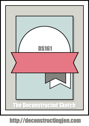
For my card I am using Deconstructed Sketch 161 and Carta Bella So Noted designer papers.  I thought these papers worked beautifully with the inspiration photo. I chose the scripted background pattern and stamped two of the larger images from Peaceful Medallions.   I used a smokey shadow ink.  I used the smaller flower from Button Best  stamp set to stamp inside of the medallions using lavender moon ink.  I love how the medallions are subtle yet create a look of texture.  They blend in, but are noticeable.  I bet if I had not mentioned that I stamped them you would have thought they were part of the papers.  That is what is so amazing about these images.  From focal point to backgrounds they help create or build a look.      

Next, I die cut a background panel using Verve's Cut Above Classy Label die  for the background element in the sketch.  I decided to use a smokey gray card stock for this.  I stamped two  sentiments from Happy Place stamp set.  I embossed one in white and one in black.  Love the contrast.  Then, I die cut the flower  from the Happy Doodles die set and stamped it with coordinating flower from Happy Place.  I just love this flower.   I colored it with copics.  I added some vellum embossed banners using the Verve's Cut Above Banner Bundle dies.  I finished my card using Verve's Shine Bright and Pastels Sequin Mix.  I am using the inspiration photo from the Fusion Challenge for my card.  I have been doing so many bold colors lately, it was nice to use some soft muted tones.  I am also Guest Designer for the Catered Crop Recipe Swap:  Vellum!


1. Julee10. Jen
2. Stacey11. Sheri {Guest}
3. Maureen12. Laurie
4. Chaitali13. Andrea
5. Marisa14. Amber
6. Teresa15. Christyne
7. Kay {Guest}16. Sarah
8. Janelle 17. Anya
9. Charmaine 18. Betty


Want to win some shiny new Verve? We're giving away a $40 gift voucher to one lucky commenter along the hop, so be sure to leave a shout out in the comments as you hop about.

Want another chance to win? Now it's your turn! We'd LOVE to see what you've done with the July release. Link up your cards using at least one product from our July release and you'll be entered in a drawing to win our entire next release! All the details and the linkup widget are on the Verve Blog today. The deadline is August 23, so there's still plenty of time to get the July release if you haven't already.


Don't miss this weekend only discount offer in honor of Julee's birthday:


I am last on the hop so you are all done!  However,  if you got here first or started midway,  make sure you start from the beginning and work your way through.  You are not going to want to miss out on your chance to win!


Catered Crop Recipe Swap ButtonDeconstructed Sketch 161


As always thanks so much for hopping by!

Betty

Friday, July 25, 2014

Pursuit of Happiness!


MFTWSC186 
Happy Friday!   I am popping in with a second card for today!  For this card, I am playing along with a few blog challenges today.  I am using the sketch from MFT Weekly Sketch Challenge.   This combination of colors is from Colour Me!  I just love these bold colors with gold metallic accenting.  I am Simon Wednesday Challenge:  Emboss It!   Simon Monday Challenge:  Mid-Summer's Theme (summer colors and HEAT embossing).

For my card I started with MFT Card Stock Sampler.  I combined Black Licorice, Razzle Berry, and Lemon Drop card stocks.  I die cut the Lemon Drop card stock with the background panel from Blueprints 15.  I then stamped the whole panel with the word happy from the Happy Everything stamp set using Ranger Watermark ink and clear embossed it.  I then die cut the Razzle Panel with Pierced Square Stax, and stamped the BG Diagonal Stripes Background stamp in black ink.   I white embossed the sentiment from Chalkboard Greetings stamp set to the black licorice that I die cut using the Pierced Circle Stax.   I sponged some white pigment ink for shadowing and effect.  I added little tags from Blueprints 1 and Blueprints 2 cut to size using mirror gold card stock.   I finished the card with gold accenting from Sequins dienamics.  I used the same mirror gold card stock for the sequins.  Love this look!


As always thanks so much for stopping by!

Betty 

PTI July 2014 Blog Hop!


Happy Friday!  Today I am playing along with PTI July Blog Hop Challenge.  This month's challenge is an inspiration piece.  


 I took inspiration from the colors, the button cards, the gingham pattern, the distressed background, and the thread.  I inked distressed everything with the PTI chamomile vintage ink.  I used rustic white card stock for the base.  I used the more rustic side to the  linen & canvas impression plate to play on the more vintage rustic feel of the inspiration piece.

I die cut the Phrase Play in kraft, rustic white, aqua mist, and pure poppy.  I layered and placed all the letters making sure to ink distress the edges of all the little pieces as well.  For the bottom sentiment panel I used the rustic white and stamped in red the basic background: gingham.  I used the larger of the patterns.  I thought the pattern was too vibrant so I cut a vellum piece to lay over to mute the gingham a bit.  I stamped the sentiment from the Phrase Play #1 in Palette noir black ink.   I decided to use some Tombow Aqua liquid glue to adhere this piece.  The water glue and red ink created almost a red highlighted effect behind the sentiment.  I actually liked this look so kept it.   I finished my card with some aqua and red thread and a few clear sequins for accenting.

As always thanks so much for hopping by!

Betty


Wednesday, July 23, 2014

Thinking of You! PTI MIM!


Happy Wednesday!  I am playing along with PTI Make It Monday Challenge!  This week the challenge is No Outline Watercolor!  Watercolor?  Really?   I think water coloring is my least favorite things to do in the craft room.   Now, a challenge I am all about, so let me tell you what I did.

First of all, I am trying really hard NOT to put a flower on everything I create this summer.  It is so easy to grab those flowers, though.  I searched through my PTI sets and realized the vast majority are flowers.  No shock there.  I decided that if I were to water color anything it must be a landscape.  So, I found this well loved set Masculine Motifs and knew I just had to at least try the tree image.  I tried to make the trees look more summer than winter by adding color to create leaves.    I added some layers to try and make the whole thing look finished.   I added a sentiment from Vintage Picnic Sentiments another "old" PTI favorite.  

All in all, I know I will NOT earn any accolades for my water colored landscape, but I did at least try and participate in the challenge.  Not my favorite card, but not my least favorite, either.  LOL!  I think I do need to try water coloring more.  I did find it very calming to play with ink and water.  


Thanks so much for stopping by!

Betty

Sunday, July 20, 2014

A Smile and a Thanks!


Deconstructed Sketch 160Happy Sunday!  Popping in with a couple of fun cards to share!  I am playing along with a couple of sketch challenges and color combo challenges today.   

For this first card I am playing along with The Deconstructed Sketch Challenge. This was a fun sketch to work with.  I combined the sketch with the colors from Just Us Girl Color Challenge this week.  Love these bold colors with this fun sketch.    I used MFT Card Stock Sampler.  I combined Blu Raspberry, Gum Drop, Sour Apple, Sweet Tooth, and Black Licorice.  I stamped the Blue Raspberry panel with BG Diagonal Stripes Background stamp in black ink.  I die cut the gum drop panel with the panels in Blueprints 15 and Blueprints 14(turned to get angle on panel).  I stamped the gum drop green panel with the large stitch dots from LJD Darling Dots stamp set using a light green ink.  I die cut the black licorice with MFT Rectangle Pierced Stax.  I inked up the sentiments from CS Smile in Ranger Watermark ink and heat embossed the top using Zing Leaf and Recollections Glacier powders.  I have found that these colored embossing powders seem to look better if heat embossed from underneath.  I added some white pigment ink to get the look of the restaurant chalkboards that use colored pens.  I finished the card with flowers from Blueprints 12 and accenting from Sequins dienamics.  


MFTWSC185For my second card, I am playing along with MFT Weekly Sketch Challenge and The Color Throwdown.  I just love this sketch and these colors.
 
I used MFT Card Stock Sampler.  I combined  Sweet Tooth, Sno Cone, Steel Blue, Tangy Orange, and Kraft card stocks.  I used Blueprints 13 to die cut the stitched background panel.  I used BG Diagonal Stripes Background stamp in Rangers Marigold.  I die cut the kraft card stock with the middle Rectangle Frames dienamics.  I embossed and raised the actual frame and stamped the insert with MFT Woodgrain Background, in MFT Premium Natural ink. I inked distressed the edges on the kraft card stocks only.  I then layered my sentiment die.  I must say that I am loving this new Tag Talk dienamics.  I used sno cone card stock on the top and tangy orange on the bottom.  I added a flowers from Blueprints 14.  I stamped the sweet tooth using MFT Premium Sno Cone ink using LJD Pretty Poppies stamp set(script portion).  I finished with a few touches of gray and white gems.  

As always thanks so much for stopping by!

Betty 

Friday, July 18, 2014

TOMBOW XTREME! and a Gift Card Set!


2014-07-01_140048TOM-14034-Sticky U_R2

Tombow contacted me and asked if I would be a part of Tombow Sticky University and try out their new  XTREME Permanent Adhesive by Tombow!  They had me at Tombow!   I already own quite a few different products from Tombow, so this was a no brainer!  All I have to do to get my A+ is post a project/homework assignment using this permanent XTREME adhesive!  

Sit back and enjoy because this post has lots of pictures!

MFT_Oct2012_SellSheets
For my project I decided to really put this adhesive to the test.  I created a gift box with a set of cards.   I did add some Tombow Aqua Liquid Glue to tiny parts and pieces as well as add some foam tape dimension, but for the most part the entire assembly of cards and actual box itself uses this permanent XTREME adhesive.

I came across a really cool color combo recently that I fell in love with.  It combines sweet tooth, fuse green, sno cone, and steel gray.  I just loved the look so I thought I would try it.  In recent months I have fallen head over heels with MFT Blueprints!   I reach for them all the time.  I decided to put my Blueprints 13 to the test and create cards using the sketch download provided. 

Here is stage 1.  I have cut out the dies, color card stock, and cover ups and laid the cards out based on the sketches.  The bare bones of the sketches!  I did go ahead and decide on and die cut the cover ups for each card.
   

For stage 2,   I went to work adding stamps, additional dies, and accenting to each card.   Here are all the cards completed.  Please note that these photos are taken from craft desk not card photo area.  A better picture as well as product detailed  are below.


Card 1.  I modified this sketch slightly.  I removed the circle elements and just used a sentiment instead.  No hard or fast rules on these sketches.  Just a jumping off point. 


I used Blueprints 13, Modern Morocco Cover Up, and Happy dienamics.  I used Chalkboard Greetings, CS Birthday Chalkboard Greetings, and BG Happy Birthday Background stamp sets.  I finished this card with some white thread detailing and some gray enamel dots.

Card 2 was just fun to make.  I love working with this jumbo butterfly and those fluffy clouds!

I used Blueprints 13, Cloud Cover Up, and MPD Fancy Butterfly dienamics.  I used LJD Blissful Butterfly stamp set for the sentiment.  The butterfly was die cut with solid white backing and two layers of vellum for the cut out dienamics.  I added some silver gray sparkle gems and added some stitching and this card was complete.  This card has a gray grout background.  I like how it emphasized the white clouds.


Card 3 incorporated the chalkboard look as well as a nifty embellishment idea I will definitely use again. 

For this card I used Blueprints 13, Blueprints 15, and Sequins die namics.  I used Chalkboard Greetings, MPD Distressed Hearts, and LJD Cheerful Blessings stamp sets.  I used the third largest row of the sequins and die cut all four colors.  I took a large needle and thread and started threading the discs.  I love this unique and fun detail.  I tied it to the panel and just let the discs move whichever way they want. 


Card 4 uses the same 4 colors, but I added a pop of color!  


For this card I used Blueprints 13, Blueprints 15, Happy, and Wildflowers die namics along with Peaceful Wildflowers stamp set and BG Diagonal Background.   I replaced the star from sketch with the heart from BP 15.  I white embossed the sentiment.  I stamped the wildflowers using Memento rosebud ink.  I love this unexpected pop of color.  I finished the card with some clear shimmer sequins. 


Next, I needed to create a gift box for presentation.  I used MFT Gray Grout card stock for the bottom and vellum for the top.  I added seam binding bow to top along with two gift tags.  For the tags I used MFT Blueprints Tag Builder 1 and Tag Talk die namics.  I added a happy die using the Happy die namics.


For the inside I cut 1 sheet of 12x12 vellum and glued end to end to create a fold over cover insert.  The box  is 9" x 5 1/2" The vellum was cut to size. I scored it so the folds lay flat. Gives it a finished look when opening the set.


 Here is the set all ready to go! 

As always thanks so much for stopping by!

Betty


I am playing along with the following challenges
The Friday Mashup!  Background stamp and/or 3D Element
Seize the Birthday!  Twine or string (top card uses string/thread) 
Catered Crop!  For a friend 
Shopping Our Stash  Can't Put It Down!  My Blueprints (tool)

Wednesday, July 16, 2014

Hello and Sparkle! Curtain Call, Palette Challenge,and a Sketch!


I have a couple of cards to share today!  The first card is for the Curtain Calls First Anniversary Celebration!   Wow!  Hard to believe it has been a year already!  Time flies when you are having fun!  

The challenge is "Anything Goes," but I decided to draw some inspiration from the photo Stacey provided.  I came up with a sketch based on the bookshelves and the colors works for the Just Add Ink Color Challenge.  I started with MFT Card stock Sampler.  I used sweet tooth, primitive cream, pink lemonade, and snow cone.   I used  MFT Blueprints 2 and Blueprints 13 to  create my background panel and cut out panels.  I  stamped the background pattern using the BG Notebook Paper Background stamp in pink.  JAI 222I stamped it twice to give me this angled grid look.  I inked distressed the edges on all the cut out inserts.  I stamped the pink lemonade and snow cone pieces  with DC More Washi Patterns  stamp set using Ranger Watermark Ink.  

Next, I used MFT Happy Hellos die namics and die cut 3 white and 1 primitive cream card stock and glued together.  For some added dimension I ink distressed the edges and clear embossed the entire word.  I added some coordinating thread and a few sequins and my card was complete.   I love the deep rich color this primitive cream card stock gets when clear embossed. 


Print For my next card, I am playing along with this month's MFT Color Palette Challenge. At first I was hesitant as I am not a big fan of orange.  However, this tangy orange is such a rich color of burnt orange I may need to seriously use it again.  I am also playing along with this week's Seize the Sketch Challenge.  

Again, I started with MFT Card stock Sampler.  I  used Blueprints 2 and Blueprints 15 to die cut background panels.  I stamped the Blu Raspberry with Ranger Watermark ink using BG Typewriter Text Background.  I used the fishtail die from Blueprints 13 to die cut a piece of paper to stamp the BG Notebook Paper Background stamp.   I tore this panel to create some visual interest as well as add some distressing.  I thought it played on the words to release your inner sparkle.  Instead of concealing it in an envelop which uses the Office Supplies dienamics, you should take out that sparkle and rip into it!  LOL!  I used You Were Meant to Sparkle stamp set.

I added some touches of sparkle here and there using the Sequins die and some glittered card stock.    However, the word SPARKLE was actually embossed with some aqua embossing powder.   I used the stenciled tab element from Blueprints 11  die cut with tangy orange as well as some yellow glittered card stock to fill in the sentiment.  Love this extra touch of sparkle.  I added some hemp cord to loop around the manila envelop closures.  


 As always thanks so much for stopping by!

Betty


Monday, July 14, 2014

Celebrate! MIM and More!


Happy Monday!  I had a few moments to make a card to play along with this week's PTI Make It Monday Challenge.  This week  we are to make rainbow medallions using stamps!   

The first thing I had to do was look through all of my PTI stamp sets to see which image to use for this technique.  I saw the Mums the Word set and thought it could work.  While stamping I was thinking the image would looked like a fluffy multicolored pillow; however, by the time it was completed I thought it looked like fireworks!  It only seemed normal to me to add the big star from the Seeing Star die collection to the center.   I  thought the star looked too plain so I added some texture by embossing Meadow Greens sunburst image all over the red star in Zing Rouge.  I added some watermark ink and snow white pigment to add some light and depth to the star.    I layered a few of the stars together for stability.  I added a two toned sentiment from Wet Paints III stamp set.   I finished with some silver, gold, and red sequins!   I love how it turned out!  I am playing along with Seize the Birthday Challenge.  Stars and/or Stripes!


PTI Rustic white, simply chartreuse, and pure poppy card stock, PTI pure poppy, harvest gold, simply chartreuse, hibiscus burst, hawaiian shores, and enchanted evening inks.  PTI Mums the Word and Meadow Greens stamps and  Seeing Stars Collection dies.


As always thanks so much for stopping by!

Betty
© The Things I Do With Paper. Made with love by The Dutch Lady Designs.