DCWV luxury stack

Saturday, August 8, 2009

With You...


This card is for today's SCS Inspiration Challenge(IC192). I chose this vase to as my inspiration. This card is also for the BVC09.

I love the variation of the deep red and pink tones in the vase along with some neutral hues. I decided to use some scarlet jewel and soft suede cardstock. To get the sheen of the vase I chose to use some of the DCWV Luxury stack in the pink tones in various tonal patterns. I love the soft sheen of this paper.

I am using ODBD newly release set called Jesus.

I offset layered EK Success border punches at the top and bottom. I have had a few moments with this particular border punch. I think it is sort of too big or something. Anyway, after playing around with it, I decided I like it better layered. It seems to look smaller to me when it is layered. Thought I would share my quarky border punch moment. LOL!!! To finish my card, I added a satin scarlet jewel bow and some pink pearls.

Stamps
ODBD Jesus
Paper
PTI vintage cream, scarlet jewel, SU soft suede, DVWV luxury stack
Ink
Scarlet jewel
Accessories
foam tape, EK success border punch. scarlet jewel satin ribbon, LONG small nestie rectangles, glue dots, pearls


Friday, December 19, 2008

Festive Flourishes Friday! and Blog Candy!!!!


Don't be so "blue" this holiday season! Join us for week three of the Festive Flourishes Friday Challenge! The theme is just as it sounds ~ "You'll be doing alright with your Christmas of white but I'll have a blue, blue Christmas!"Grab your favorite Flourishes stamp set and dress it up with a dose of blue! It doesn't have to be a Christmas card! Any style will do! Remember, you can join into our challenge at any time and, if you make up past challenges and complete all four - your name will be thrown into the hat for a free stamp set of your choice! Link your card to the Flourishes Newsletter or your SCS gallery. Don't forget the keyword FFFC3 on Splitcoast! Of course, we'd love it if you added the FLLC keyword too so that your work shows up in the company gallery!
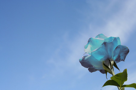
Kandi (kandicejo) pm'd me with a link to a rose that does LOOK TEAL!!!! How exciting!!!! Thanks a bunch, Kandi!!!!
http://www.jamievoetsch.com/images/070711145149_Blue_Rose_Against_Blue_Sky_LG.jpg

Bluebird come fly away with me!!!! I went with a blue and teal combo. Still keeping with the blues!!! I used taken with teal and some DCWV Pearlized Metallic luxury stack in soft hues of blue. So, this card has a sheen. I think I created a new color of rose, but I really wanted a soft teal one....lol!!!! I used a fiskars edge punch, some stickles, and pearls to add some detailing. I finished it off with some touches of pearls in the corners to match my papers pearlized sheen. The ribbon really does match in real life.

You can visit Julie’s Festive Flourishes Friday Blog Team weekly roundup over at the Flourishes Newsletter, and also visit these Friends of Flourishes blogs to get the complete Flourishes Friday scoop Becca Feeken, Christine Okken, Cindy Haffner , Dee Jackson , and Kimberly Crawford. Also, introducing Silke Ledlow as the newest Friends of Flourishes. Two of the friends have BLOG Candy!!!!! You will not want to miss out so hop around and find out who!!!!

STAMPS
I Love Roses, Birds in Vines
PAPER
taken with teal, DCWV, Strathmore water color paper
INK
black staz on, taken with teal, old olive
ACCESSORIES
Nestabilities, stickles, oval punch, halfback pearls, fiskars border punch, ribbon, aqua painter, blender pens
© The Things I Do With Paper. Made with love by The Dutch Lady Designs.